
How to Choose Bedroom Colors That Don’t Look Dated or Overdone

There’s something deeply personal about choosing a bedroom color. This isn’t your living room, where you worry about guests or trends, and it’s definitely not the kitchen, where practicality wins every argument. The bedroom is where your day ends and begins again.
I’ve repainted my bedroom more times than I want to confess, and every single time I thought this would finally be “the one.” Sometimes it was. Sometimes I lasted six months before realizing the color felt heavy, cold, or just… wrong.
That’s the tricky part about bedroom paint colors: they look one way on a sample card and completely different at 11:30 PM when the lamp is on and your phone is lighting up half the room.
This article isn’t about perfect, magazine-ready bedrooms. It’s about real combinations that work in real homes — small rooms, awkward windows, rental compromises, personal moods, and all.
A quick thought before we dive in
“A bedroom color shouldn’t impress anyone. It should quietly support you.”
Keep that in mind as you read. If a color makes you feel calm, safe, energized, or grounded, that’s the right direction — even if it’s not trending.
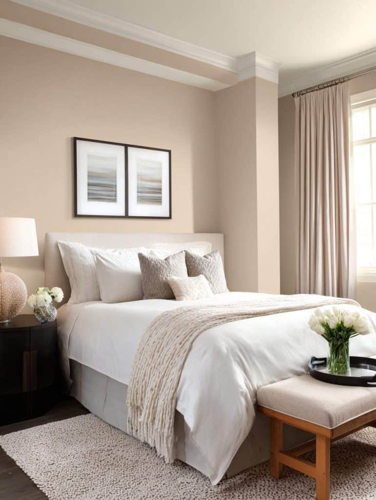
1. Soft White + Warm Beige (the underrated classic)
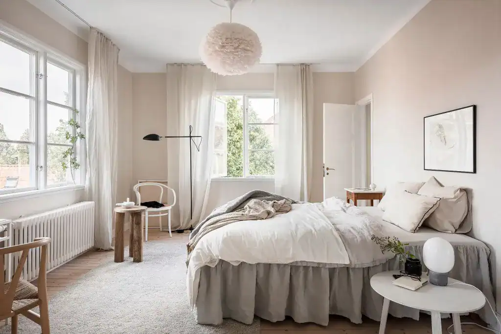
White bedrooms get a bad reputation for being boring, but the problem is usually the wrong white. Pairing a soft, creamy white with warm beige accents creates a bedroom that feels calm without feeling empty.
This combo works especially well if:
- You have wood furniture
- You want flexibility with decor
- You get decent natural light
A trick I’ve learned: use white on three walls and a beige-toned wall behind the bed. It adds depth without screaming “accent wall.”
Why it works:
White reflects light, beige absorbs just enough warmth to keep the room from feeling sterile.
2. Sage Green + Off-White (calm, but not sleepy)
Sage green has quietly become a bedroom favorite, and for good reason. It’s soft, natural, and doesn’t overwhelm your senses. When paired with an off-white (not bright white), it feels balanced and breathable.
I’ve seen this combination work beautifully in both modern and rustic spaces.
Where it shines:
- Bedrooms with plants
- Minimal or Scandinavian interiors
- South- or west-facing rooms
Pro tip: Avoid pairing sage with cool grays — it kills the warmth instantly.
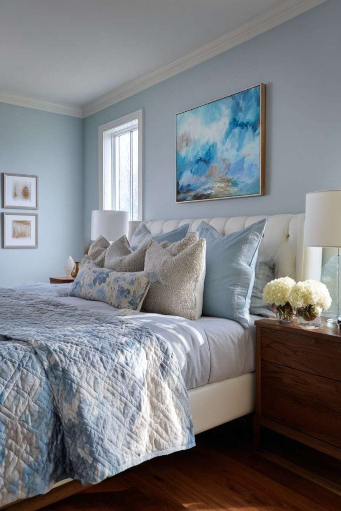
3. Dusty Blue + Cream (quietly romantic)
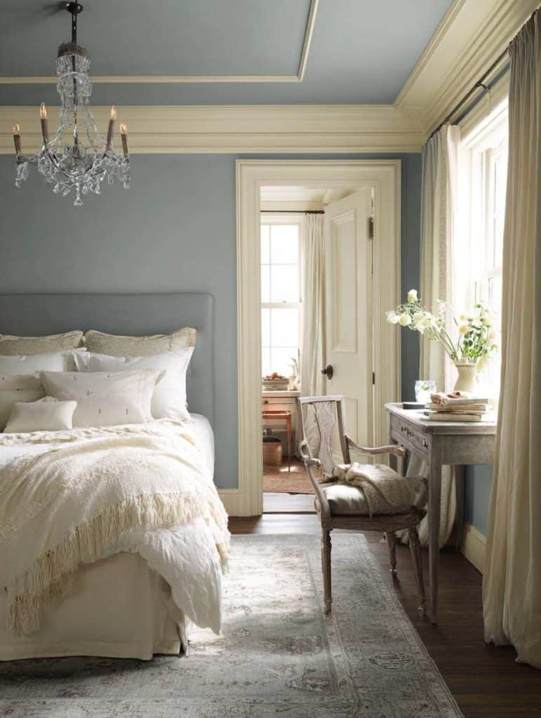
Dusty blue isn’t navy. It isn’t baby blue either. It sits somewhere in between, slightly muted, slightly moody. When you pair it with cream instead of stark white, the room feels softer and more intentional.
This color combination has a way of slowing your breathing down when you walk in.
Here’s a quick comparison to help visualize it:
| Color Element | Dusty Blue + Cream | Navy + White |
|---|---|---|
| Mood | Calm, cozy | Bold, sharp |
| Light reflection | Medium | Low |
| Best for sleep | Yes | Sometimes |
| Works in small rooms | Yes | Rarely |
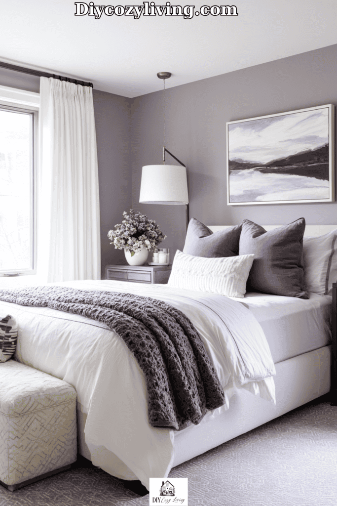
4. Warm Gray + Blush (subtle but emotional)
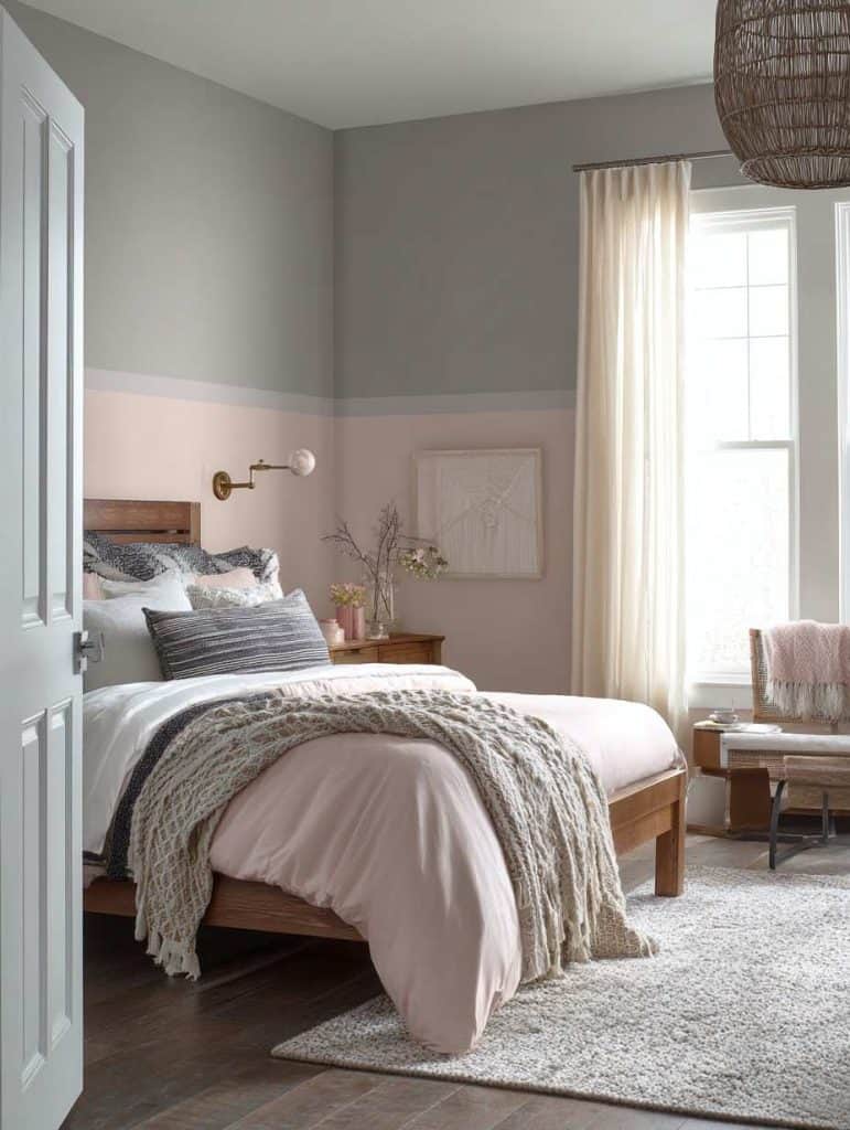
Gray bedrooms often feel cold — unless you warm them up. A warm gray (think greige, not concrete) paired with blush or muted pink accents can completely change the atmosphere.
This isn’t a “pink bedroom.” It’s more like a whisper of warmth.
You might use:
- Gray on the walls
- Blush in textiles, art, or one soft accent wall
Unexpected benefit: This combo flatters skin tones, which matters more than you think when you’re waking up and looking in the mirror.
5. Terracotta + Soft White (earthy and grounded)
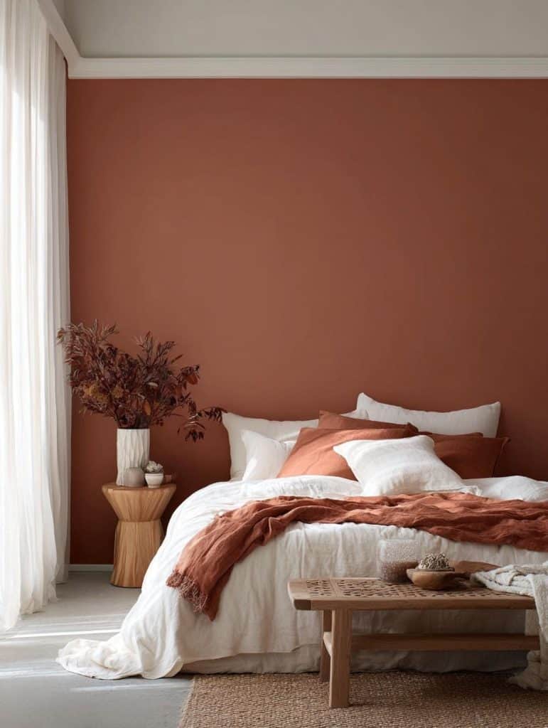
Terracotta is having a moment, but in bedrooms it needs restraint. Full terracotta walls can feel heavy, especially in smaller spaces. The magic happens when you soften it with white.
Think:
- One terracotta wall
- White ceiling and trim
- Natural fabrics everywhere
This combo feels especially good if your life is hectic. There’s something grounding about earthy tones that modern colors can’t replicate.
6. Lavender Gray + Warm White (unexpectedly soothing)
Lavender doesn’t need to be sweet or childish. When it’s mixed with gray — just enough — it becomes refined and calm.
This color pairing works best in rooms that get softer daylight, especially morning light.
What to avoid:
- Bright purples
- Cool, blue-based whites
- High-gloss finishes
Keep everything matte and soft, and the room will feel like a quiet exhale.
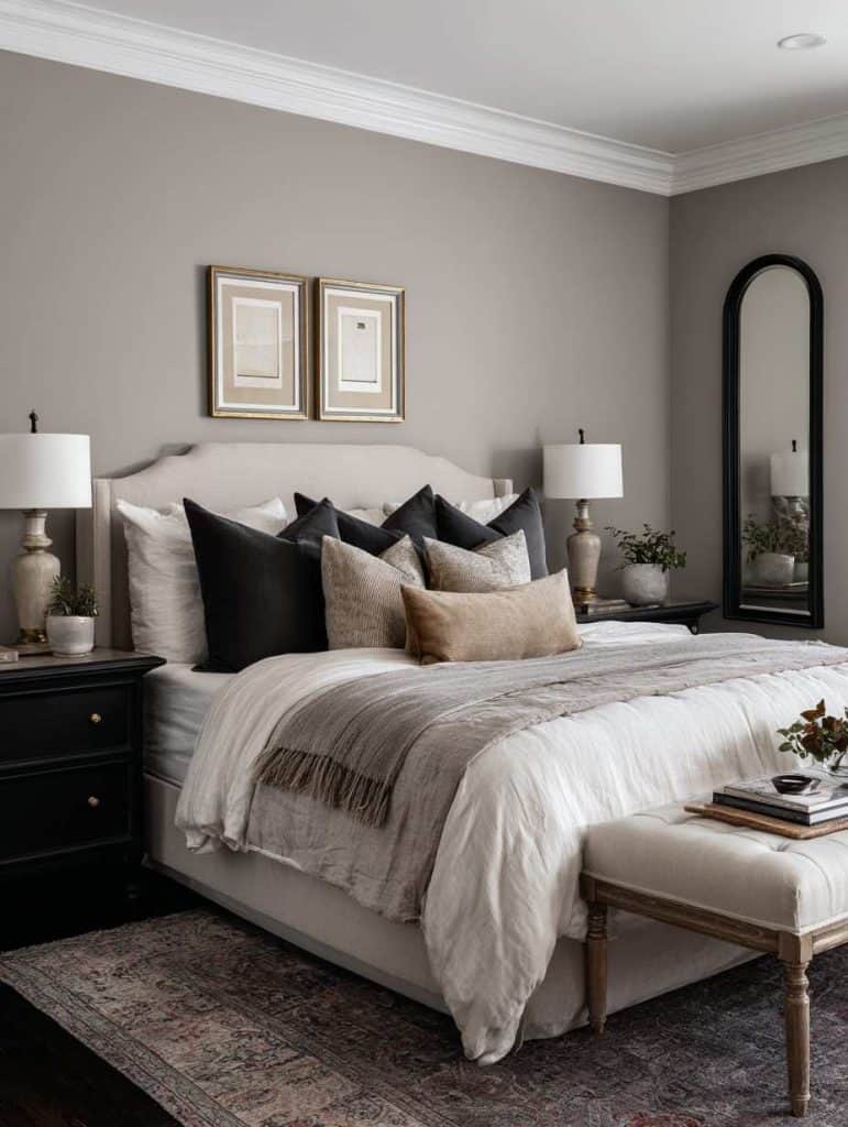
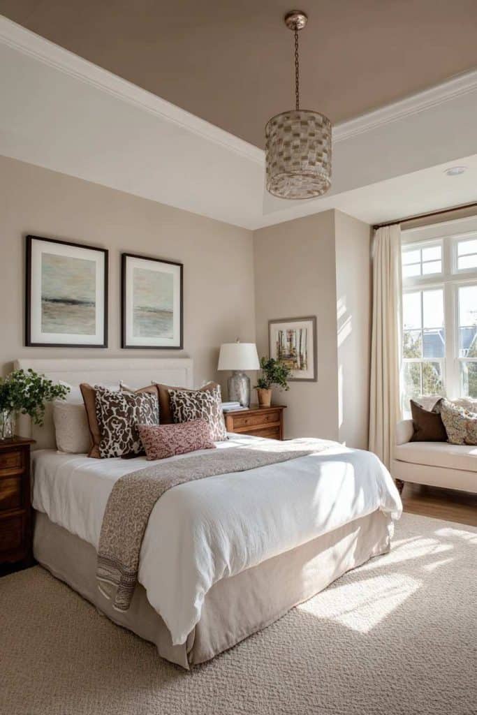
7. Taupe + Deep Charcoal (cozy without darkness)
This is one of those combinations that sounds risky until you see it done right. Taupe keeps things warm, charcoal adds depth.
Instead of painting all walls dark, try this:
- Taupe walls
- Charcoal on doors, trim, or the wall behind the headboard
It creates intimacy without making the room feel smaller.
8. Pale Peach + Cream (soft light, soft mood)

Pale peach reflects light beautifully, especially in rooms that feel dim or north-facing. When paired with cream, it creates a subtle glow that feels welcoming rather than flashy.
This combination works surprisingly well in:
- Older homes
- Bedrooms with low ceilings
- Spaces with minimal decor
You don’t need much else — the color does the work for you.
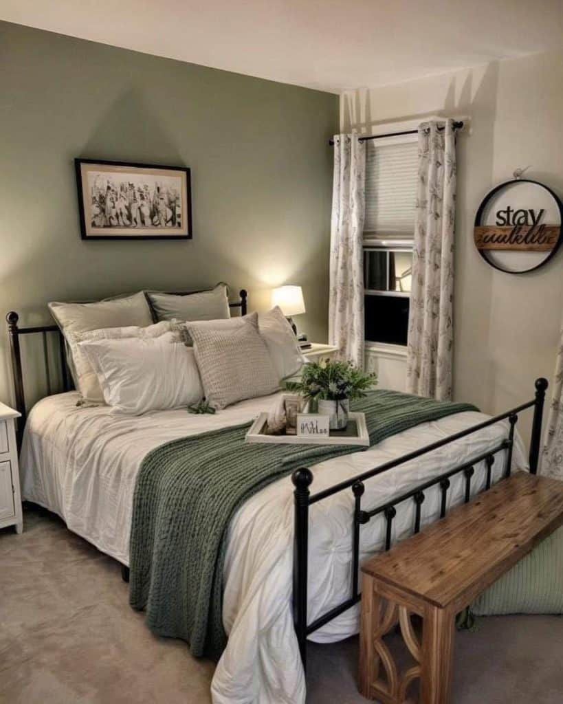
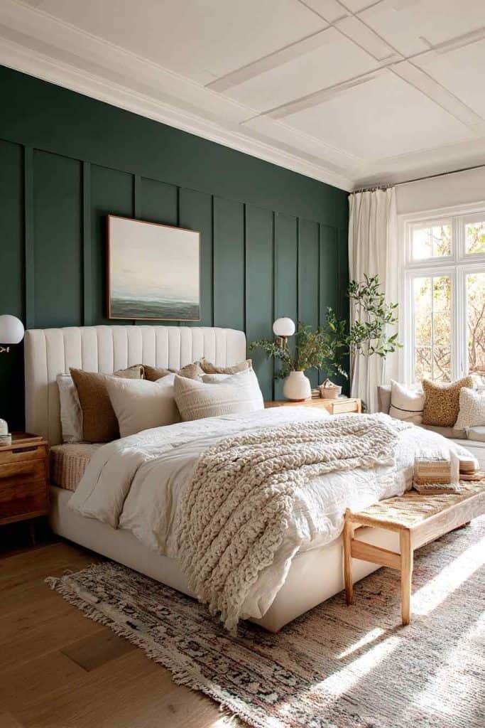
9. Olive Green + Warm Wood Tones (nature-inspired calm)
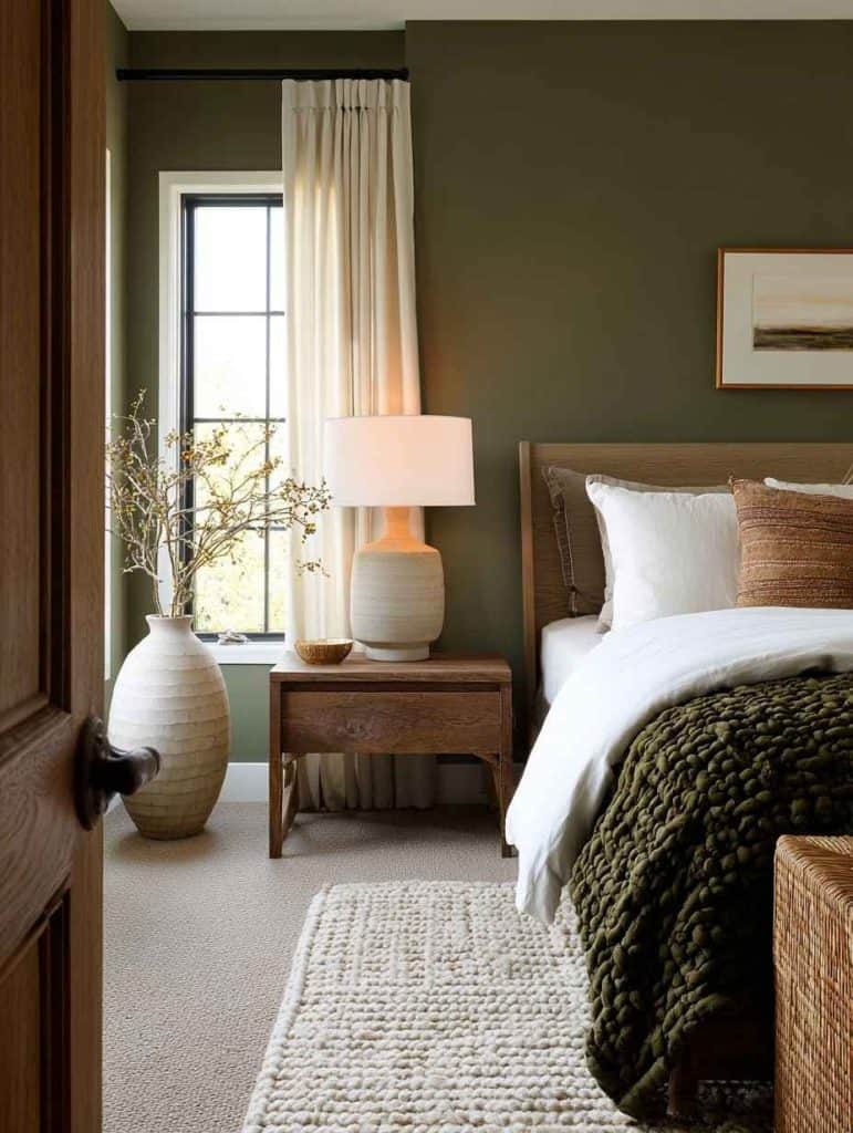
Olive green brings depth without the heaviness of forest green. Pair it with warm wood tones — not cool oak or gray-washed finishes — and the room instantly feels grounded.
Here’s a quick list of what pairs well with olive walls:
- Walnut furniture
- Linen bedding
- Brass or aged gold hardware
- Soft white curtains
It’s a color that feels mature, calm, and timeless.
10. Muted Teal + Soft Sand (calm with a little personality)
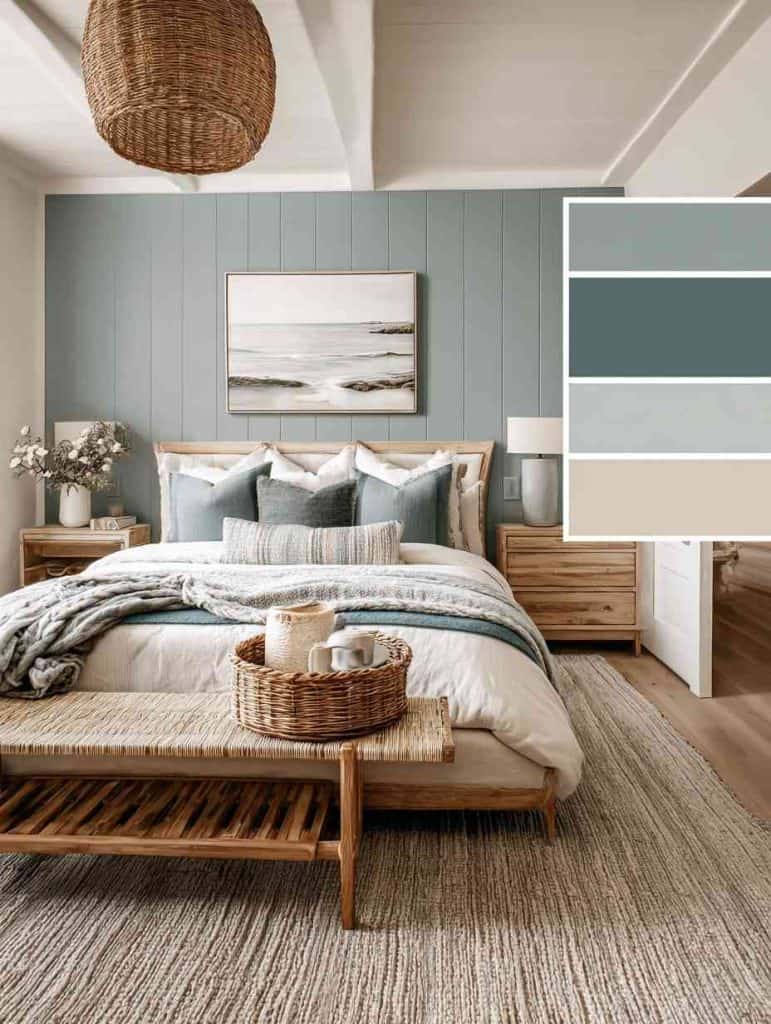
Teal is one of those colors that can go very wrong very fast. Too bright and it feels loud. Too dark and it turns heavy. But when teal is muted — slightly gray, slightly softened — it becomes an incredible bedroom color.
Pairing muted teal with a soft sand or light beige keeps the room grounded. This combination works especially well if you want a bedroom that feels calm but not sleepy.
I once painted a guest bedroom this combination thinking it would feel “too much.” It ended up being the room everyone wanted to sleep in.
Best places to use it:
- Accent wall behind the bed
- Rooms with white or light flooring
- Spaces with woven textures (rugs, baskets, headboards)
11. Deep Navy + Crisp White (bold, but controlled)
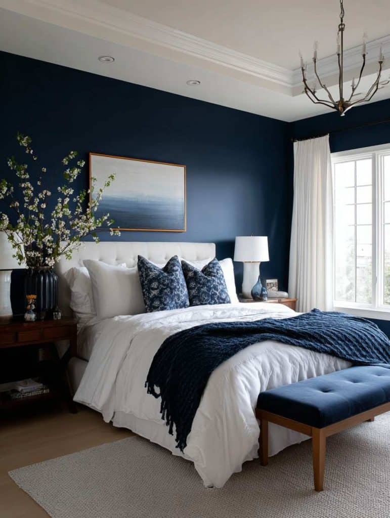
Navy in the bedroom can feel dramatic, but when done thoughtfully, it’s surprisingly restful. The key is contrast and balance.
Instead of painting every wall navy, try:
- Navy on the main wall
- White or very light gray on the remaining walls
- White bedding to break up the darkness
Here’s a simple breakdown of when navy works and when it doesn’t:
| Works Well When | Feels Too Heavy When |
|---|---|
| Room has good lighting | Room is small and dark |
| White trim is present | Trim is dark or missing |
| Bedding is light | Everything is dark |
Navy has a way of making a bedroom feel protected, almost cocoon-like — which some people absolutely love.
12. Warm Greige + Soft Black Accents (modern and grounded)
Greige is the quiet hero of bedroom paint colors. It’s not flashy, it doesn’t demand attention, but it creates a perfect backdrop for almost anything.
Adding soft black accents — not jet black, but charcoal or near-black — brings modern structure to the room.
This combination works beautifully if you like:
- Minimal decor
- Clean lines
- A slightly hotel-inspired feel
A black metal bed frame against greige walls can look incredibly intentional without being cold.
13. Clay Pink + Light Gray (grown-up softness)
This isn’t pink in the traditional sense. Clay pink leans earthy, dusty, and muted. When paired with a light gray, it feels calm and mature.
It’s one of those combinations that surprises people — especially those who “don’t like pink.”
What makes it work:
- The pink has brown undertones
- The gray is warm, not blue-based
- Natural textures are layered in
This color pairing feels comforting without feeling emotional or dramatic.
14. Soft Mocha + Cream (warm and enveloping)
Mocha walls create an instant sense of warmth. They wrap the room rather than bounce light around it. When paired with cream, the effect is rich but not heavy.
This combination works best in bedrooms where:
- You want a cozy, intimate feel
- The space is used mainly at night
- Lighting is warm (no cool LEDs)
Mocha walls with cream bedding feel luxurious without trying too hard.
15. Pale Blue-Gray + White Oak (light, airy, and clean)
Blue-gray can easily turn cold, but when you choose a pale, balanced shade and pair it with white oak or light wood tones, the room feels fresh and breathable.
This combination is ideal for:
- Small bedrooms
- Minimalist spaces
- Homes with lots of natural light
It’s a color pairing that doesn’t demand much — and sometimes that’s exactly what a bedroom needs.
16. Forest Green + Warm White (dramatic but soothing)
Forest green is deep and emotional, but it has a natural calm to it. When paired with warm white, it becomes grounded rather than overwhelming.
Instead of painting every wall, consider:
- Forest green behind the bed
- Warm white everywhere else
- Brass or wood accents
This combination feels especially good in colder months, when you want your bedroom to feel like a retreat.
17. Soft Yellow + Cream (quiet optimism)
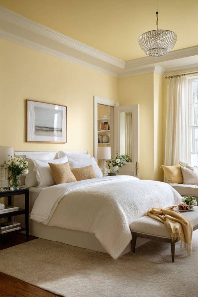
Yellow gets a bad reputation in bedrooms, mostly because people choose shades that are too bright. Soft, muted yellow — almost buttery — can feel incredibly uplifting.
Paired with cream, it creates a gentle glow that works beautifully in rooms with limited natural light.
This color combo:
- Feels warm without being loud
- Helps dark rooms feel brighter
- Adds subtle cheer without stealing attention
It’s not trendy, but it’s comforting — and that counts for a lot.
18. Two-Tone Neutrals (depth without color overload)
If committing to color feels intimidating, two-tone neutrals are a great alternative.
Examples that work well:
- Light beige upper walls + deeper taupe lower walls
- Warm white walls + darker trim
- Soft gray walls + creamy ceiling
Two-tone bedrooms add visual interest without overwhelming the senses. They’re especially useful in rental homes where bold color isn’t an option.
Lighting changes everything (and most people ignore this)
One of the biggest mistakes people make when choosing bedroom paint is ignoring lighting.
A color at noon:
- Looks brighter
- Feels cooler
- Shows more contrast
The same color at night:
- Looks deeper
- Feels warmer
- Can feel heavier
Before committing, always test paint at different times of day. Sit with it. Sleep in the room if you can. A bedroom color should feel right when you’re tired, not just when you’re standing there judging it.
A final thought before you choose
Your bedroom doesn’t need to follow rules. It needs to follow you.
Trends change. Your life shifts. What you need from your bedroom today may not be what you need in five years — and that’s okay.
The best bedroom paint colors aren’t the boldest or the safest. They’re the ones that quietly support rest, comfort, and peace without asking for attention.

I’m Katerina Lithopoulou, co-creator of DIY Cozy Living. I’ve always loved the little things that make a space feel special. With a background in language and a passion for photography and cozy design, I enjoy turning everyday inspiration into simple ideas people can actually use.
My motto: “Cozy isn’t a trend — it’s a feeling.”
