How to Style an Entryway That Looks So Good That Guests Stop and Snap Photos
Your hall is the initial view people get of your house – and really, it’s the area which determines how inviting and neat your home appears to be.
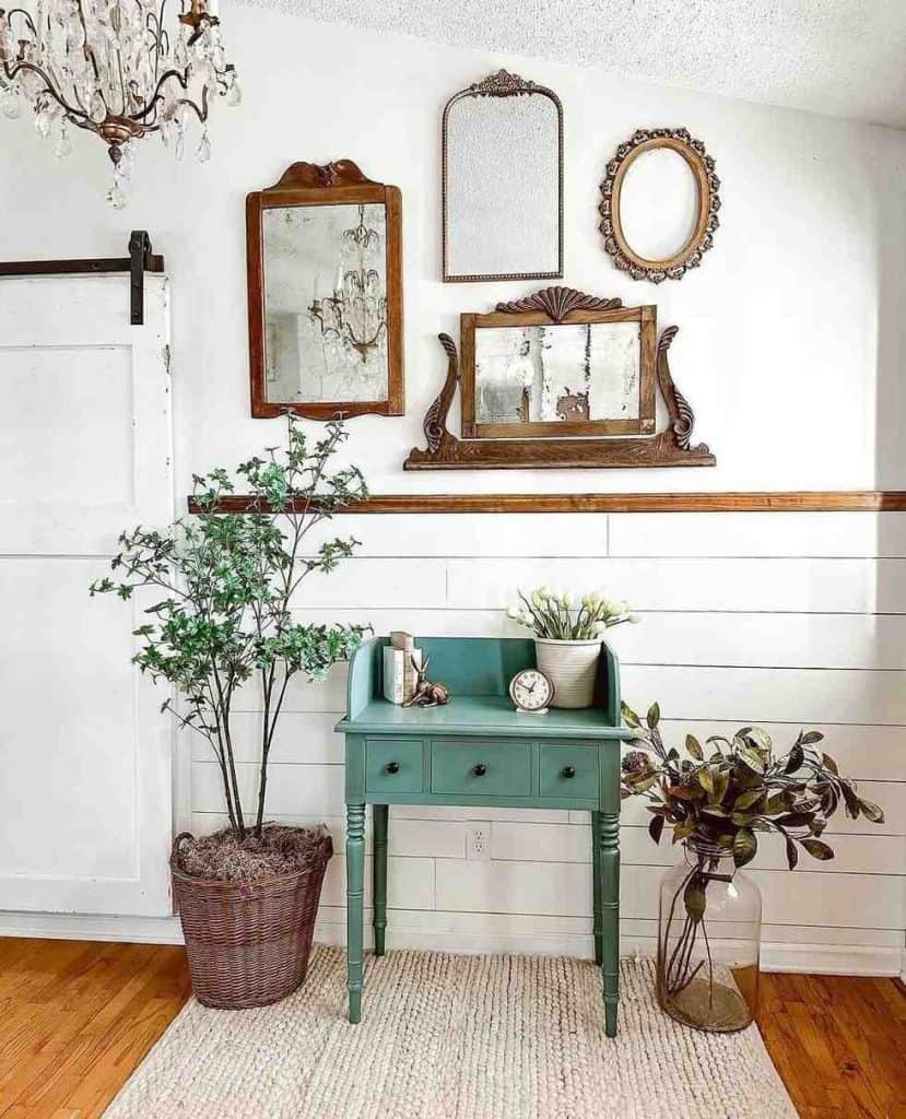
I’ve constantly been fond of the way a nicely arranged entrance can cause even a little hallway to appear cosy, tidy and show a lot of character; it doesn’t matter if you’re on a low budget, going with new trends – such as patterned pale colours and things from nature – or simply need something simple to look after all year.
Everything from cheap hall table arrangements, and clever keeping-things-hidden storing, to changes for the time of year, for example, new garlands in the autumn or pale plants in the spring.
In this article, I’m going to show you a number of my favourite hall decorating ideas which get the right mix of low price, look, easy care and simple seasonal changes – no huge, difficult makeovers needed.
Without further ado, let;s get into it!!!
The Economics of the Entrance
Before we talk about style, we must talk about value. Many homeowners neglect the foyer because they do not spend hours there. This is a mistake. The entryway is the handshake of the house. It is the first thing a buyer sees and the last thing you see before you leave.
| Budget Level | Typical Projects | Expected Outcome |
| Low | Paint, foraged nature, thrifted bowls. | High style through effort. |
| Medium | Quality consoles, designer lighting, performance rugs. | A polished, professional look. |
| High | Custom cabinetry, stone surfaces, integrated lighting. | Architectural permanence. |
You should spend the most on items that touch the floor or the wall.
A cheap rug will look worn within months. A high-quality wool or jute rug will last for years. Similarly, a heavy lamp is better than a lightweight plastic one. Weight translates to quality in the mind of the viewer.
21 Design Concepts for a Modern Entrance
The trends of 2026 are moving away from the sterile and the plastic. We are entering an era of Soft Brutalism and traditional nature. This means we value things that feel raw, heavy, and human.
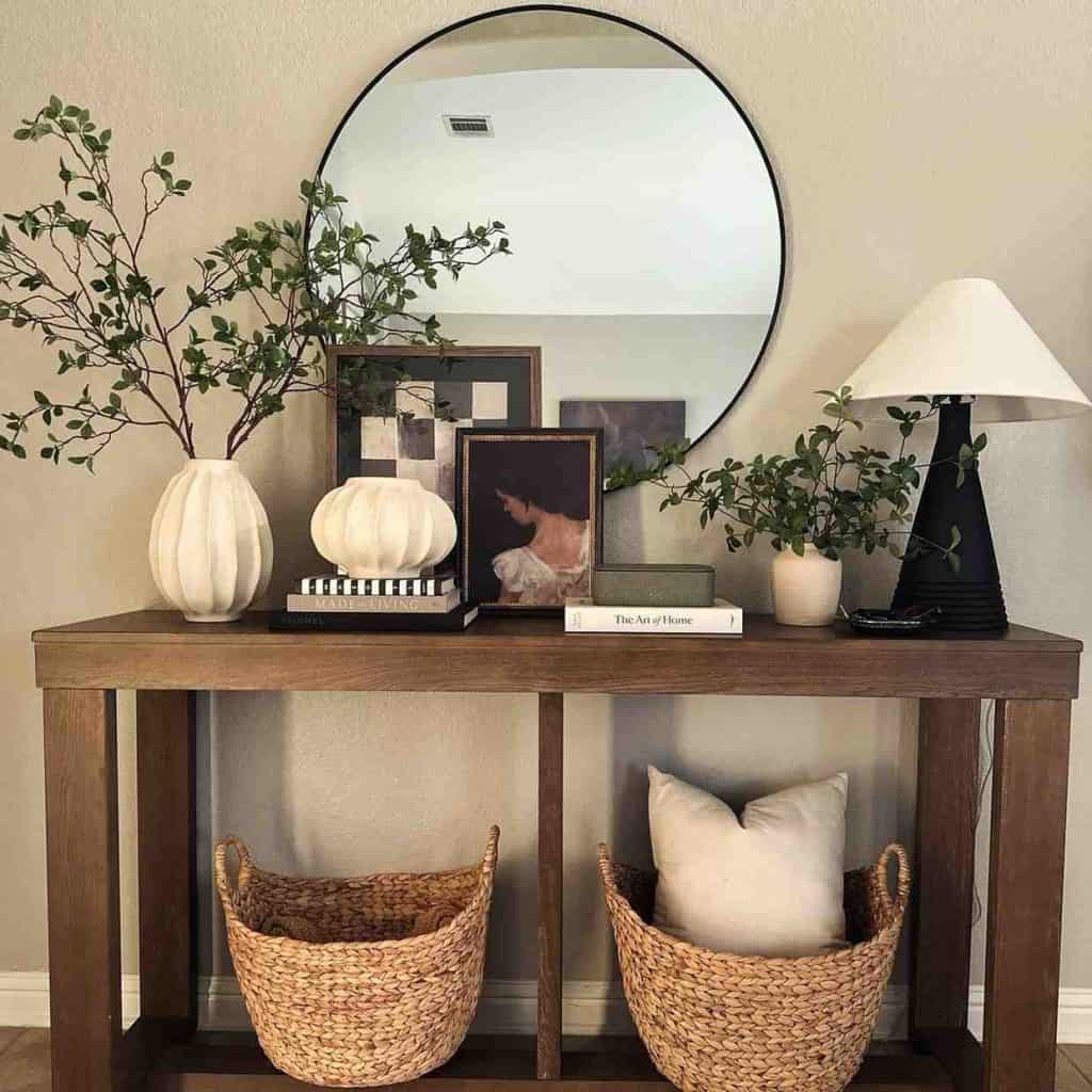
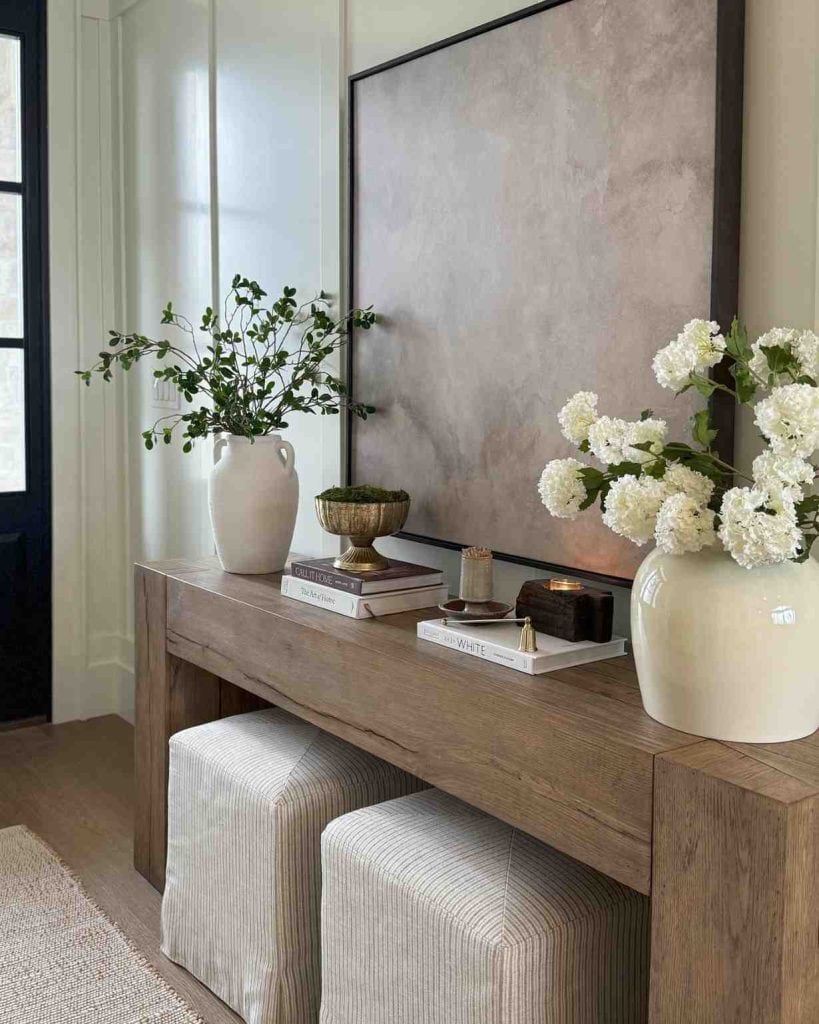
1. The Monolithic Stone Console
Traditional tables with four thin legs are being replaced by solid, heavy blocks. A monolithic console made of travertine or poured concrete acts as an anchor. The beauty of stone is its porosity and the way it catches the light. When you use a single, massive piece of stone, it feels like a sculpture rather than a piece of furniture. It creates a center of gravity that makes the rest of the hallway feel stable and grounded.
2. Integrated Architectural Seating
Instead of pushing a bench against a wall, we are seeing seats built directly into the house. A floating wooden bench anchored into a niche or a concrete ledge that extends from the wall creates a seamless look.
This removes the clutter of extra furniture legs and makes a narrow hallway feel much wider. It also provides a dedicated spot to sit and remove shoes, which reinforces the habit of keeping the home clean.
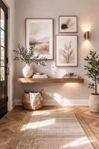
3. The Scale of the Oversized Mirror
A mirror is a functional tool for a final check before leaving, but its primary design job is to manipulate light.
In 2026, the trend is toward massive, floor-to-ceiling mirrors or wide, horizontal panels that dissolve the wall.
If you have a small entry, a large mirror makes the brain think there is another room beyond the glass. Angle it slightly toward a window or an open doorway to pull the outside light deep into the center of the home.
4. Tactile Wall Treatments and Surface Depth
Drywall is a missed opportunity for texture. Using lime wash or a clay-based plaster creates a soft, matte finish that feels ancient and modern at the same time.
These materials breathe and age gracefully. They also absorb light rather than reflecting it harshly, which creates a softer, more inviting atmosphere.
Fluted wood or stone panels can also be used to add vertical rhythm and hide imperfections in the architecture.
5. Nature and the Vertical Anchor
Every entryway needs an object that draws the eye upward. A tall, dry branch or a single, massive leaf in a heavy vessel serves this purpose.
This is part of the Bio-Design 2.0 movement, which emphasizes raw, un-processed natural elements.
The goal is to bring the wildness of the outdoors into the structured environment of the home. This provides a bridge between the nature you just left and the comfort of the interior.
6. Emotional Luxury Through Lighting
Lighting should never be an afterthought.
In 2026, we are moving away from bright, white light and toward warm, amber tones around 2200K to 2700K. This mimics the glow of a fire or a sunset.
Use a table lamp with an opaque shade so the light is forced up and down, highlighting the texture of the wall and the table. Avoid the big light in the ceiling; it flattens the room and makes it feel clinical.
7. The Art Halo and Shadow Work
Shadow is just as important as light. By placing a small, concealed light behind a piece of leaning art or a mirror, you create a halo effect.
This gives the object a sense of depth and makes it feel like it is floating in space. It turns a simple wall into a theatrical experience. Shadows in the corners of the room add a layer of mystery and make the entryway feel like an intimate sanctuary.
8. Sensory Branding and Scent Identity
Scent is the most powerful memory trigger in the human brain. Your home should have a signature scent that greets you at the door.
For 2026, we are seeing a move away from sweet or floral scents and toward environmental notes like smoked wood, cedar, and wet stone. Use a high-end cold-air diffuser that disperses scent evenly without heat or water.
This creates a consistent, sophisticated atmosphere that becomes part of the home’s identity.
9. The Rule of Three in Materials
To make a console table look professional, you need to balance three distinct types of materials.
You need something organic like wood or linen, something mineral like stone or ceramic, and something industrial like metal or glass.
The friction between these different textures creates visual interest. A raw oak table topped with a marble tray and a brass lamp is a perfect example of this balance.
10. Floating Footprints for Narrow Spaces
In smaller homes, every inch of floor space counts.
A wall-mounted floating console keeps the floor visible all the way to the baseboard, which tricks the eye into seeing more room.
For 2026, these are being made in chunky, thick profiles—like a six-inch-thick slab of wood or plaster—to give them the visual weight of a piece of furniture without the bulk of legs.
11. Color Drenching for Perceptual Clarity
If you have a small, choppy entryway with many doors and frames, use color drenching.
This means painting the walls, the ceiling, the doors, and the baseboards the same deep color.
This hides the messy architectural lines and makes the space feel like one cohesive, immersive volume. It creates a dramatic entrance that signals you have entered a different environment.
Performance Textiles
The floor is the most abused surface in your home. In an entryway, a rug isn’t just a piece of decor; it is a sacrificial barrier.
Most people make the mistake of buying a synthetic rug because it is cheap and easy to replace, but these fibers tend to trap oils and look grey within months. In 2026, the preference is for high-density natural fibers like jute, sisal, or over-dyed wool.
Wool is naturally coated in lanolin, which makes it resistant to moisture and staining. A high-pile wool rug can swallow an incredible amount of dirt before it even begins to look messy.
On the other hand, jute and sisal provide a scratchy, organic texture that physically cleans the bottom of your shoes as you walk over it. The key to the wow factor here is scale. The rug should be large enough that you can take at least three full steps on it before hitting the main flooring of the house. This ensures that the transition is both visual and physical.
Vertical Organization and the Mail Sandwich
Horizontal surfaces are magnets for chaos. The moment you lay a letter flat on a table, you have invited more letters to join it.
To maintain a clean entryway, you must force yourself to organize vertically. Using heavy, architectural bookends—think solid brass or carved granite—allows you to sandwich your mail upright.
This does two things.
First, it makes the mail look like a deliberate part of the design, almost like a collection of folders in a library.
Second, it exposes the edges of the envelopes, which acts as a psychological nudge to deal with them immediately. When mail is stacked horizontally, the bottom letter is forgotten. When it is held vertically, every item is visible, and the visual clutter is reduced by 70%.
Avoid The Digital Interface!
Your entryway is often the hub for the house’s less attractive technology, such as Wi-Fi routers, security hubs, and charging cables. Nothing kills a high-end atmosphere faster than a glowing blue light and a tangle of black wires.
By placing your router inside a breathable, non-metallic container, you maintain your signal strength while removing the visual noise.
For charging, look for stone trays with integrated wireless coils. You can set your phone down on a piece of marble and have it charge without ever seeing a cable. This is the definition of invisible luxury.
15. Geometric Layering with the Support Stool
A console table on its own can feel a bit lonely against a long wall. To add complexity without adding clutter, you need to layer in a support stool. This is a small, sculptural seat that sits partially tucked under the table.
It provides a secondary level of height and a different material. If your table is wood, use a stool made of black metal or fluted plaster.
This creates a geometric relationship between the two pieces. Practically, it serves as a landing spot for a bag or a place to sit for a moment while you struggle with a stubborn pair of boots. It bridges the gap between the furniture and the floor, making the entire vignette feel anchored.
The Meaning of Geological Objects
In a world dominated by mass-produced plastic, there is a profound luxury in things that were formed over millions of years. Placing a large, raw mineral on your entry table provides a sense of primitive weight.
Consider a heavy chunk of obsidian with its glass-like sharp edges, or a slab of petrified wood that carries the rings of an ancient tree.
These objects don’t need to be polished; in fact, they are better when they are raw and jagged. They provide a tactile contrast to the smooth surface of a mirror or a lamp. When a guest walks in and sees a ten-pound piece of the earth’s crust sitting on a stack of books, they immediately understand that this home values substance over trends.
17. The Art of the Visual Overlap
Designers often see homeowners lining objects up like soldiers in a row. This is a mistake. To make a space look lived-in and high-end, you must embrace the overlap.
The edge of your lamp shade should partially block the view of your mirror. Your vase should sit slightly in front of your leaning art.
This creates layers of depth that the human eye finds much more interesting than a flat line. It suggests that the objects were placed over time, rather than being part of a set. It gives the entryway a curated, gallery-like feel where every piece has a relationship with the one next to it.
18. Acoustic Engineering and the Luxury of Silence
We often talk about how an entry looks, but we rarely talk about how it sounds. Most hallways are echo chambers made of hard wood, glass, and drywall. This creates a harsh, clattery sound when you drop your keys or close the door.
To create a truly high-end transition, you need to soften the acoustics. This can be done through heavy linen curtains over the door, upholstered benches, or even felt-backed wall panels.
When the sound of the outside world is suddenly muffled the moment you step inside, the sense of sanctuary is immediate. Silence is one of the most overlooked luxuries in modern design.
19. The Tactile Feedback of Handcrafted Hardware
The things you touch every day should be the highest quality items in your house. Most people live with the standard doorknobs and hooks that came with the property. Replacing these with handcrafted versions is a small change with a massive impact.
Unlacquered brass, sand-cast bronze, and hand-forged iron feel different in the hand. They have a weight and a temperature that plastic or cheap alloy cannot match. As you use them, they develop a patina—a record of your movements. This is the soul of a home. When a guest reaches for a heavy, cool-to-the-touch brass handle, they are receiving a physical message about the quality of the space they are about to enter.
20. Habitual Order and the Reset Tray
Every entry needs a reset tray. This is a dedicated spot for the items that don’t have a permanent home—receipts, loose change, or that random screw you found on the sidewalk.
Instead of letting these things migrate across the table, they stay in the tray. Once a week, usually on a Sunday, you empty the tray.
This prevents the slow creep of clutter that eventually buries even the best design. By giving the chaos a boundary, you protect the rest of the table’s aesthetic.
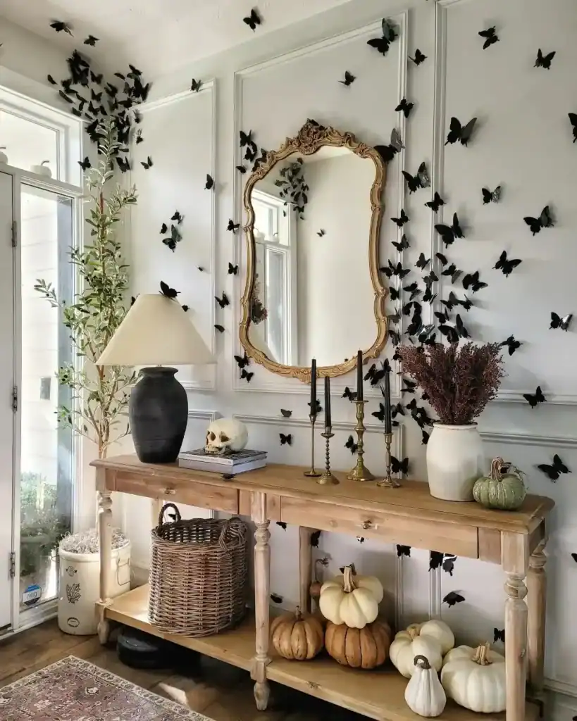
21. Dynamic Seasonality through Natural Cycles
True style is not static.
Your entryway should acknowledge the changing world outside. In 2026, we avoid the plastic pumpkins and the fake snow of the past. Instead, we use the natural pulse of the seasons.
Practical Maintenance and Survival
A beautiful entryway is useless if it cannot handle a rainy day. You must plan for the worst weather.
The secret to a clean home is a two-step barrier. Use a heavy-duty mat outside the door to catch the grit. Use a high-quality rug inside to catch the moisture. If you only have one, the dirt will travel into your living room.
If you have a mirror, expect fingerprints. Choose a frame that allows you to clean the glass easily. Avoid mirrors that are glued directly to the wall without a border, as the cleaning spray can damage the wall finish over time.
For those with children or pets, the bottom two feet of the wall are the danger zone. Use a scrubbable paint finish or a durable wall covering like wood slats. This ensures that a wet dog or a muddy backpack does not ruin the design.
The Seasonal Pulse
During summer, a dish of citrus fruits will appear clean and cheerful. During winter, use a dish of walnuts or pinecones instead.
These little alterations recognise the season, without filling the area with things that are only there briefly.
The heaviness of cloths can be altered as well. A light linen strip is ideal for hot weather. A thick wool or velvet cloth gives warmth as it gets colder.
| Season | Material Shift | Natural Element | Scent Profile |
| Winter | Heavy wools, dark metals. | Evergreen boughs, white stones. | Smoked Agarwood & Ash. |
| Spring | Light linens, clear glass. | Flowering fruit branches. | Rain-soaked Earth & Iris. |
| Summer | Rattan, bleached woods. | Dried grasses or fresh citrus. | Sea Salt & Bergamot. |
| Autumn | Velvet, burnt ceramics. | Foraged seed pods, dried oak. | Tobacco Leaf & Cedar. |
What we Learned Today
Making your hall nice doesn’t need to be hard or costly – it is mostly about producing a nice first feeling, which is ‘you’, whilst still being useful for daily existence.
If you favour current styles such as earthy materials and soft shades, change seasonal things to keep it new without much work, or centre on easy-to-clean keeping which hides shoes and keys, small careful touches make the largest change.
In the last analysis, the best halls are those which greet you – and your visitors – with a cosy feeling, stay easy to deal with during busy seasons, and still look easily fashionable, year after year.
Select one or two ideas which attract you, begin small, and view how that little place immediately improves the complete sense of your house – happy decorating!
Until next time,
Stay safe,


I’m Katerina Lithopoulou, co-creator of DIY Cozy Living. I’ve always loved the little things that make a space feel special. With a background in language and a passion for photography and cozy design, I enjoy turning everyday inspiration into simple ideas people can actually use.
My motto: “Cozy isn’t a trend — it’s a feeling.”
